 |
|
|||||||
| SageTV v7 Customizations This forums is for discussing and sharing user-created modifications for the SageTV version 7 application created by using the SageTV Studio or through the use of external plugins. Use this forum to discuss plugins for SageTV version 7 and newer. |
 |
|
|
Thread Tools | Search this Thread | Display Modes |
|
#121
|
|||
|
|||
|
Quote:
 I've also toyed with the idea of the background in just a small pane to be less distracting... iirc diamond does this now.. or maybe in screenshots of the new version... i forget where i saw it I've also toyed with the idea of the background in just a small pane to be less distracting... iirc diamond does this now.. or maybe in screenshots of the new version... i forget where i saw it 
__________________
Server 2003 r2 32bit, SageTV9 (finally!) 2x Dual HDHR (OTA), 1x HD-PVR (Comcast), 1x HDHR-3CC via SageDCT (Comcast) 2x HD300, 1x SageClient (Win10 Test/Development) Check out TVExplorer |
|
#122
|
||||
|
||||
|
Quote:
__________________
Windows Vista Home Premium 2.40 gigahertz Intel Core2 Quad Q6600 4 Meg Ram HDHR, Hauppauge WinTV HVR-1800 1.5 TB USB SATA Drive |
|
#123
|
|||
|
|||
|
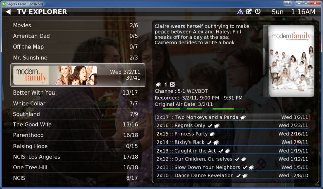
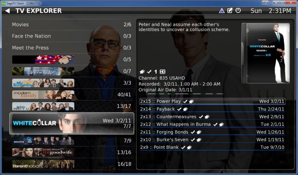
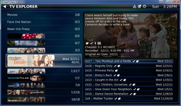
More screnshots :)
Another screenshot to share with everyone. More refinement of the ui and panels... Let me know what everyone thinks.
One thing I'm considering doing with this tweaking of the ui is to get rid of the customization of the height of the group (left) table. with the right side layed out the way it is it doesn't lend itself to being shrunk very easliy (currently not customizable... the overall height of the episode table is customizable but not the rest of it). So since the right really isnt customizable in height I'm thinking that left side shouldn't be either. Also when the banners are only on for the highlighted episode you can still see lots of the background fanart... Anyway let me know your thoughts  (full size image also attached...) (full size image also attached...)
__________________
Server 2003 r2 32bit, SageTV9 (finally!) 2x Dual HDHR (OTA), 1x HD-PVR (Comcast), 1x HDHR-3CC via SageDCT (Comcast) 2x HD300, 1x SageClient (Win10 Test/Development) Check out TVExplorer |
|
#124
|
|||
|
|||
|
Quote:
Cheers, J |
|
#125
|
||||
|
||||
|
Forgive me for the length of this post, razr, but I think it's necessary in order to "make my case".
 I'm still not big on showing the banner for only the highlighted show. It seems like "why bother?" at that point. To me, the banners are meant to add some character to the display; a "wow" factor, for lack of a better word (I know some people despise that word). By showing it only on the highlighted show, that's gone. Plus, how long are you really going to have the show highlighted to see that banner? By the time the banner displays, you're ready to hit OK and select an episode. I'm still not big on showing the banner for only the highlighted show. It seems like "why bother?" at that point. To me, the banners are meant to add some character to the display; a "wow" factor, for lack of a better word (I know some people despise that word). By showing it only on the highlighted show, that's gone. Plus, how long are you really going to have the show highlighted to see that banner? By the time the banner displays, you're ready to hit OK and select an episode.Additionally, I can pick out my shows very quickly just from the banner. Like this, I actually have to read the banners. I realize that sounds stupid or lazy, but going on "look" rather than text is nice. I think I can illustrate this "issue" better by relating it to movies. A text listing of movies is dull, isn't it? Isn't this why people love the wall view in SMM or Diamond? It's the same thing with music. Who doesn't want to see the album coverart when browsing their library? Would you want to see it only on the album you have highlighted? I know I wouldn't.  You know I'm a huge fan of TVE and I respect your work immensely, but I'm having a difficult time understanding the reasoning behind this. If the reason is so that fanart can be more easily seen behind the group listing because you like a full vertical listing AND want to see fanart, then I'd suggest what someone else did and move it to the right page, rather than as a full background. Put it behind the entire right pane, behind just the info area on the top, or just behind the episode list. I can't end this with all "bad" comments (even if it is just a single--albeit very long--comment), so I will say that I do really like the changes to the right side. I think it's a great use of the space. 
__________________
Server: XP, SuperMicro X9SAE-V, i7 3770T, Thermalright Archon SB-E, 32GB Corsair DDR3, 2 x IBM M1015, Corsair HX1000W PSU, CoolerMaster CM Storm Stryker case Storage: 2 x Addonics 5-in-3 3.5" bays, 1 x Addonics 4-in-1 2.5" bay, 24TB Client: Windows 7 64-bit, Foxconn G9657MA-8EKRS2H, Core2Duo E6600, Zalman CNPS7500, 2GB Corsair, 320GB, HIS ATI 4650, Antec Fusion Tuners: 2 x HD-PVR (HTTP tuning), 2 x HDHR, USB-UIRT Software: SageTV 7 |
|
#126
|
||||
|
||||
|
Quote:
 The new Diamond does this too and offers both ways but honestly I like the two pane view in TVE (and in Malore) better than having to go into the episode listing like in Diamond. Gerry
__________________
Big Gerr _______ Server - WHS 2011: Sage 7.1.9 - 1 x HD Prime and 2 x HDHomeRun - Intel Atom D525 1.6 GHz, Acer Easystore, RAM 4 GB, 4 x 2TB hotswap drives, 1 x 2TB USB ext Clients: 2 x PC Clients, 1 x HD300, 2 x HD-200, 1 x HD-100 DEV Client: Win 7 Ultimate 64 bit - AMD 64 x2 6000+, Gigabyte GA-MA790GP-DS4H MB, RAM 4GB, HD OS:500GB, DATA:1 x 500GB, Pace RGN STB. |
|
#127
|
|||
|
|||
|
Quote:
 Quote:
 
__________________
Server 2003 r2 32bit, SageTV9 (finally!) 2x Dual HDHR (OTA), 1x HD-PVR (Comcast), 1x HDHR-3CC via SageDCT (Comcast) 2x HD300, 1x SageClient (Win10 Test/Development) Check out TVExplorer |
|
#128
|
|||
|
|||
|
now for my harshest credit and what i think is one of TVE's biggest fans
 Quote:
 But I can appreciate that not everybody sees the world as I do so that's what options are for (see previous post But I can appreciate that not everybody sees the world as I do so that's what options are for (see previous post  ) )Also just as a side note... the banner stays there when you browse over to the right to highlight a particular episode... Quote:
 Quote:
__________________
Server 2003 r2 32bit, SageTV9 (finally!) 2x Dual HDHR (OTA), 1x HD-PVR (Comcast), 1x HDHR-3CC via SageDCT (Comcast) 2x HD300, 1x SageClient (Win10 Test/Development) Check out TVExplorer |
|
#129
|
|||
|
|||
|
Quote:
Quote:

__________________
Server 2003 r2 32bit, SageTV9 (finally!) 2x Dual HDHR (OTA), 1x HD-PVR (Comcast), 1x HDHR-3CC via SageDCT (Comcast) 2x HD300, 1x SageClient (Win10 Test/Development) Check out TVExplorer |
|
#130
|
||||
|
||||
|
Very much what I was talking about a few days ago. Looks good, and I like how you extended the right pane up to include the info.
__________________
Buy Fuzzy a beer! (Fuzzy likes beer) unRAID Server: i7-6700, 32GB RAM, Dual 128GB SSD cache and 13TB pool, with SageTVv9, openDCT, Logitech Media Server and Plex Media Server each in Dockers. Sources: HRHR Prime with Charter CableCard. HDHR-US for OTA. Primary Client: HD-300 through XBoxOne in Living Room, Samsung HLT-6189S Other Clients: Mi Box in Master Bedroom, HD-200 in kids room |
|
#131
|
|||
|
|||
|
Well, this certainly isn't scientific or anything, but I just had my wife look at the three examples that you have shown.
She likes the fanart in the background, as well as the poster and info on the top right. And her comment was that displaying all the banners makes it appear a little too busy. Therefore her choice (which also happens to be mine  ) is #1. ) is #1.Grant |
|
#132
|
|||
|
|||
|
Quote:
those are my favorites too... but thats why choice is good right  ... I am kinda digging the background behind the info right now... probalby bc i just did it ... I am kinda digging the background behind the info right now... probalby bc i just did it 
__________________
Server 2003 r2 32bit, SageTV9 (finally!) 2x Dual HDHR (OTA), 1x HD-PVR (Comcast), 1x HDHR-3CC via SageDCT (Comcast) 2x HD300, 1x SageClient (Win10 Test/Development) Check out TVExplorer |
|
#133
|
||||
|
||||
|
Quote:
 Quote:
I do like the fanart behind the info area. You sure made quick work of that!  The only issue I see is that now there's no place to put cover art for movies. You don't usually have cover art for TV shows until the first season is released on DVD, so that's not a big deal, but I imagine others might also miss the movie cover art. Just thinking out loud here... what about only showing cover art for movies? Would it be possible to hide the cover art box when showing TV content? The only issue I see is that now there's no place to put cover art for movies. You don't usually have cover art for TV shows until the first season is released on DVD, so that's not a big deal, but I imagine others might also miss the movie cover art. Just thinking out loud here... what about only showing cover art for movies? Would it be possible to hide the cover art box when showing TV content?As long as I'm in the "pie in the sky" mode, how about folder or content locks (stock parental code entry would be fine), to keep the kiddies from viewing anything we don't want? I'm talking about fully concealing the fact that it's recorded, not just preventing playback. User categories, combined with ratings, should allow enough customizing for that.
__________________
Server: XP, SuperMicro X9SAE-V, i7 3770T, Thermalright Archon SB-E, 32GB Corsair DDR3, 2 x IBM M1015, Corsair HX1000W PSU, CoolerMaster CM Storm Stryker case Storage: 2 x Addonics 5-in-3 3.5" bays, 1 x Addonics 4-in-1 2.5" bay, 24TB Client: Windows 7 64-bit, Foxconn G9657MA-8EKRS2H, Core2Duo E6600, Zalman CNPS7500, 2GB Corsair, 320GB, HIS ATI 4650, Antec Fusion Tuners: 2 x HD-PVR (HTTP tuning), 2 x HDHR, USB-UIRT Software: SageTV 7 |
|
#134
|
||||
|
||||
|
Bah.. you shouldn't be looking at movies from TVE anyways... :-) No need for covers for tv.
__________________
Buy Fuzzy a beer! (Fuzzy likes beer) unRAID Server: i7-6700, 32GB RAM, Dual 128GB SSD cache and 13TB pool, with SageTVv9, openDCT, Logitech Media Server and Plex Media Server each in Dockers. Sources: HRHR Prime with Charter CableCard. HDHR-US for OTA. Primary Client: HD-300 through XBoxOne in Living Room, Samsung HLT-6189S Other Clients: Mi Box in Master Bedroom, HD-200 in kids room |
|
#135
|
||||
|
||||
|
Quote:
 While I actually do agree, my personal movie collection is still in its infancy, so my movie content is mostly recordings. I prefer having everything in one place (or menu), so using TVE for everything makes sense to me... for now. As my personal movie collection keeps growing, something like Diamond will definitely be put to use. While I actually do agree, my personal movie collection is still in its infancy, so my movie content is mostly recordings. I prefer having everything in one place (or menu), so using TVE for everything makes sense to me... for now. As my personal movie collection keeps growing, something like Diamond will definitely be put to use.
__________________
Server: XP, SuperMicro X9SAE-V, i7 3770T, Thermalright Archon SB-E, 32GB Corsair DDR3, 2 x IBM M1015, Corsair HX1000W PSU, CoolerMaster CM Storm Stryker case Storage: 2 x Addonics 5-in-3 3.5" bays, 1 x Addonics 4-in-1 2.5" bay, 24TB Client: Windows 7 64-bit, Foxconn G9657MA-8EKRS2H, Core2Duo E6600, Zalman CNPS7500, 2GB Corsair, 320GB, HIS ATI 4650, Antec Fusion Tuners: 2 x HD-PVR (HTTP tuning), 2 x HDHR, USB-UIRT Software: SageTV 7 |
|
#136
|
||||
|
||||
|
I like this too. Especially the background art with the info in front of it. In almost any other theme or movie add-in where you have the option of turning on the background art there is almost way too much stuff in front of it to even get a good idea of what the background art it. Nice job.
Gerry
__________________
Big Gerr _______ Server - WHS 2011: Sage 7.1.9 - 1 x HD Prime and 2 x HDHomeRun - Intel Atom D525 1.6 GHz, Acer Easystore, RAM 4 GB, 4 x 2TB hotswap drives, 1 x 2TB USB ext Clients: 2 x PC Clients, 1 x HD300, 2 x HD-200, 1 x HD-100 DEV Client: Win 7 Ultimate 64 bit - AMD 64 x2 6000+, Gigabyte GA-MA790GP-DS4H MB, RAM 4GB, HD OS:500GB, DATA:1 x 500GB, Pace RGN STB. |
|
#137
|
||||
|
||||
|
I've been using tve since it's inception and I think all the screenshots are great. I don't like to be the devil's advocate, but some like the ability to shrink the left side (me included) with fanart as the background while others like the left from top to bottom with fanart in the top right corner with the info on top or a combination of the two. That as well as the ability to have banners show all the time or just for the show selected. My advice is to make them all options. Whether or not this would be easy to implement is another matter, but I think that would make everyone happy (as if that were possible).
Thoughts?
__________________
SageTV Server: unRAID Docker v9, S2600CPJ, Norco 24 hot swap bay case, 2x Xeon 2670, 64 GB DDR3, 3x Colossus for DirecTV, HDHR for OTA Living room: nVidia Shield TV, Sage Mini Client, 65" Panasonic VT60 Bedroom: Xiomi Mi Box, Sage Mini Client, 42" Panasonic PZ800u Theater: nVidia Shield TV, mini client, Plex for movies, 120" screen. Mitsubishi HC4000. Denon X4300H. 7.4.4 speaker setup. |
|
#138
|
|||
|
|||
|
Quote:
 i think my favorite is still the list, banners only on the focused, full frame fanart... i think my favorite is still the list, banners only on the focused, full frame fanart...Quote:
 )... but more importantly i think having an adjustable left side height will look silly if the right side is full height (which is currently not adjustable)... not to mention all the code for determining menu backgrounds, etc, etc, etc. )... but more importantly i think having an adjustable left side height will look silly if the right side is full height (which is currently not adjustable)... not to mention all the code for determining menu backgrounds, etc, etc, etc.So here is what I am thinking regarding the browser/layout config... (all of the grouping, sorting, filtering, display options aren't going anywhere... and eventually will be much more robust  ) )Not Adjustable: -Overall height of the left or right panels Adjustable -left vs. right panel width -overall height of episode table relative to the right panel (maybe... all the screen shots show it at 50% ... and it might end up not being adjustable but for now lets assume it is...) -number of groups in left panel -number or episodes in right panel -banners on none, all, or focused group -font sizes (font style follows currently loaded theme) -fanart background behind the whole menu or just behind the right info panel (video while playing bg will be in the same place i think) -poster on/off
__________________
Server 2003 r2 32bit, SageTV9 (finally!) 2x Dual HDHR (OTA), 1x HD-PVR (Comcast), 1x HDHR-3CC via SageDCT (Comcast) 2x HD300, 1x SageClient (Win10 Test/Development) Check out TVExplorer Last edited by razrsharpe; 03-09-2011 at 08:03 AM. |
|
#139
|
|||
|
|||
|
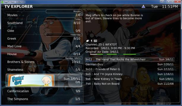
And another screenie to share
 Group Dividers... right now its just for when sorting the groups by date... eventually I'll add alpha dividers as well Group Dividers... right now its just for when sorting the groups by date... eventually I'll add alpha dividers as well  ... the layout is not 100% complete and i want to make a different divider graphic but you get the idea... as always larger version is attached ... the layout is not 100% complete and i want to make a different divider graphic but you get the idea... as always larger version is attached
__________________
Server 2003 r2 32bit, SageTV9 (finally!) 2x Dual HDHR (OTA), 1x HD-PVR (Comcast), 1x HDHR-3CC via SageDCT (Comcast) 2x HD300, 1x SageClient (Win10 Test/Development) Check out TVExplorer |
|
#140
|
||||
|
||||
|
I like the idea of the "date dividers", but what purpose does an alpha divider serve? Then, again, I could see it being a great visual aid when "jumping" to groups beginning with that letter and showing you that you're there. It'd be great if this were a prelude to such a "jump" feature.
__________________
Server: XP, SuperMicro X9SAE-V, i7 3770T, Thermalright Archon SB-E, 32GB Corsair DDR3, 2 x IBM M1015, Corsair HX1000W PSU, CoolerMaster CM Storm Stryker case Storage: 2 x Addonics 5-in-3 3.5" bays, 1 x Addonics 4-in-1 2.5" bay, 24TB Client: Windows 7 64-bit, Foxconn G9657MA-8EKRS2H, Core2Duo E6600, Zalman CNPS7500, 2GB Corsair, 320GB, HIS ATI 4650, Antec Fusion Tuners: 2 x HD-PVR (HTTP tuning), 2 x HDHR, USB-UIRT Software: SageTV 7 |
 |
| Currently Active Users Viewing This Thread: 1 (0 members and 1 guests) | |
|
|
 Similar Threads
|
||||
| Thread | Thread Starter | Forum | Replies | Last Post |
| EXETuner Plugin with Sage7 | Graygeek | Hardware Support | 13 | 05-08-2011 10:52 AM |
| STV Import: TVExplorer for SageMC | razrsharpe | SageMC Custom Interface | 704 | 01-23-2011 01:36 PM |
| tvexplorer availability | Hunter69 | SageTV v7 Customizations | 6 | 05-21-2010 08:03 AM |
| STV Import: TVExplorer for SageMC new version notification Thread | razrsharpe | Customization Announcements | 3 | 03-06-2010 07:45 PM |
| STV Import: TVExplorer for the Default STV | tmiranda | Customization Announcements | 0 | 02-15-2010 06:14 AM |